

UX Case study : IBM Cloud : 2025
Role
Product Designer
Contribution
Research · IA · Interaction Design · Prototyping · Validation
Focus
Systems UX · Information Architecture · Developer Experience
Simplifying a fragmented Cloud Notification system
Overview
Summary
The challenge
Configuring a notification required users to understand multiple interconnected concepts across disconnected workflows. The experience mirrored the underlying system more closely than the way users thought about their task.
The Solution
A unified workflow with guided configuration, clearer routing visibility, and fewer concepts for users to manage.
My Goal
Create a clearer mental model and a guided workflow that lets developers configure and validate notifications without having to understand every underlying system object.
The Solution
A simpler configuration model that reduced setup complexity, made routing relationships easier to understand, and gave users clearer feedback before going live.

Understanding the problem space , what was breaking and why
Discover
01

IBM Cloud Event Notifications is the alert nervous system of cloud infrastructure. It lets developers route real-time alerts security incidents, pipeline failures, service outages to destinations like Slack, PagerDuty, email, or custom webhooks.
Think of it as a traffic controller for critical information. When it breaks down, engineers go blind. Teams miss incidents. Systems fail silently.
What is IBM Event Notifications?
Context
40 / 100
User satisfaction score
(industry benchmark: 68+)
30%
Configurations silently
failing in production
8%
Critical automations
breaking due to misconfig
50 +
Touchpoints to complete
a single setup
Problem definition
What Was Breaking?
Engineers were spending hours configuring alerts and still getting it wrong. Support tickets were piling up for tasks that should have taken minutes. The design goal was clear: a developer should be able to configure a working notification in under 10 minutes, without reading documentation.
User pain points
-
No real-time validation errors only discovered after saving
-
Sources, topics, and subscriptions created on separate disconnected pages
-
Technical jargon like "Source ID" unexplained and intimidating
-
No overview of active notifications or delivery status
-
Destination configs had to be recreated from scratch every time
Business pain points
-
40/100 OSAT score well below the 68+ industry benchmark
-
3,600+ configuration failures logged per cycle
-
High support dependency for basic setup tasks
-
Competitive disadvantage vs Azure Event Grid and AWS SNS
Current working demonstration
Research
Discovery Methods
User Interviews
Moderated sessions with DevOps engineers and platform operators. Covered background, cloud tool usage, EN configuration experience, competitor tools, and unmet expectations. 8 participants across internal and external users.
Qualitative
As-Is Journey Mapping
Mapped every user touchpoint in the existing EN console 50+ steps captured. Exposed fragmented navigation, page redirects mid-task, and missing validation feedback at every stage.
Journey mapping
Competitor Analysis
Benchmarked IBM EN against Azure Event Grid, AWS SNS, Google Pub/Sub, and PagerDuty. Evaluated onboarding, configuration UX, monitoring, and documentation quality.
Benchmarking
Desk Research
Studied the Event-Driven Architecture market (projected $10–12B by 2030), CE Processing trends, and enterprise demand for real-time observable workflows. IBM had a visual UI advantage it wasn't being used.
Market research
Competitive Landscape
What Competitors Were Doing
Azure Event Grid
Step-by-step guided setup wizard. New users complete configuration in under 5 minutes with contextual tooltips at every decision point.
Guided flow reduces initial cognitive load
AWS SNS
Robust content-based message filtering with query builder. Users control exactly which events route to which destination with granular precision.
Advanced filtering gives power users confidence
Google Pub/Sub
Unified monitoring dashboard showing message flow, delivery status, and failure rate in real time. One screen answers is my setup working?
Single dashboard eliminates status anxiety
IBM EN advantage
Most competitors are CLI-first. IBM has a visual UI but it wasn't being used effectively. This was an underexploited competitive edge.
Double down on visual configuration, not CLI
Synthesising insights into design direction
Define
02
User
Who Are We Designing For?
Pradeep
DevOps Engineer · 7 years experience · manages CI/CD pipelines for a 40-person team
"I don't want to learn Event Notifications. I just need my alerts to work."

His situation
When a deployment fails at 2am, Pradeep needs the right person paged immediately. His first attempt at IBM EN took 45 minutes and he still wasn't sure if his notifications were even active. He opened a support ticket just to confirm his config was correct.
What he needs
-
Set up a working alert in one session, not across multiple pages
-
Reuse Slack and PagerDuty destinations he's already configured
-
Immediate feedback if something is misconfigured
-
Complete setup without opening documentation
Design Principles
What Guided Every Decision
Principle 01
Principle 02
Principle 03
One path, no dead ends
Configuration flows in a single direction — Topic → Filters → subscription with no page redirects or context switching mid-task.
Visible, not hidden
Active filters, configuration status, and subscription state are always on screen. Nothing should require an extra click to discover.
Reuse, don't rebuild
Once a destination like Slack or PagerDuty is configured, it can be attached to any future notification without recreating it from scratch.
High impact, low effort : Build first
-
Simplified navigation with flat hierarchy
-
Improved labeling and plain-language terminology
-
Contextual help tooltips with real-time validation
High impact, high effort : Plan for
-
Visual routing configuration builder
-
Template library with pre-built configurations
-
Advanced filtering with query builder
Exploring architecture and testing concepts
Ideate
03
Exploration
Two Approaches Considered
I explored two distinct architectural models for how users configure event routing. Both were prototyped and tested with 5 DevOps engineers in moderated sessions.
Concept A - Route object
Each Route is a single pathway : 1 source → 1 topic → 1 destination. Individual components are reusable independently from a Components menu.
-
Familiar naming route resonated with engineers
-
Flexible: components reusable independently
-
One destination per route frustrated users who needed fan-out
-
Users felt limited for real-world use cases
Concept B - Event Router
Multi-destination flow
One unified object routes 1 source → 1 topic → multiple destinations in a single guided creation flow.
-
Matches the real-world use case: one failure → alert Slack AND PagerDuty
-
Guided flow reduced decision fatigue significantly
-
92% task completion vs 78% for Concept A
-
Less standalone component flexibility on its own
Design Decisions
Key Calls and the Reasoning Behind Them
Decision: Subscription becomes a backend concept
The biggest architectural debate: should Subscription be visible to users as a top level object? The backend API requires a subscription to bridge topics to destinations. But exposing it in the UI added a layer of complexity that confused every user in testing.
I pushed back on engineering's initial instinct to mirror the API structure in the UI. We kept Subscription as a backend concept users never see the word. The UI shows only Routes, Topics, and Destinations.
The decision
The API structure doesn't need to mirror the UI. Hiding Subscription simplified the mental model without losing any functionality.
Decision: Combine both concepts
Testing showed users wanted two things:
-
The term Route felt more familiar and easier to understand.
-
The ability to send one alert to multiple destinations matched real-world workflows.
The final design combined both ideas using the simpler Route terminology while keeping the flexible multi-destination workflow. We also carried forward reusable components through the Attach existing feature to make setup faster and more efficient.
Validation
Usability Testing
5 moderated remote sessions, 45–60 minutes each. Tested both concepts with real DevOps engineers on navigation, component reuse, and terminology clarity.
Metric
Concept A
Concept B
Task Complition
UMUX score
User satisfaction
78%
7.2/10
3.6/5
92%
8.3/10
4.0/5
" B was more clear instead of creating confusion with two options, I just had one option and all configurations were there."
— Participant 3, Senior Developer
Finding 01
Users got lost switching pages
Every participant lost track of their progress when the flow redirected to external pages for source or destination creation.
→ Consolidated into a 4-step progress stepper on one page
Finding 02
Route preferred over Event Router
All participants responded to the term Route familiar from networking and CI/CD mental models. Event Router felt like an IBM-internal term.
→ Renamed to Route, kept Concept B workflow
Finding 03
Component reuse was valued
All participants praised the ability to attach existing Slack or PagerDuty destinations without re-entering details the fan-out feature resonated immediately.
→ Introduced Attach existing Component Menu
The end-to-end Event Notifications experience
Design
04
The transformation
Before vs After- The 5 Biggest Changes
Engineers were spending hours configuring alerts and still getting it wrong. Support tickets were piling up for tasks that should have taken minutes. The design goal was clear: a developer should be able to configure a working notification in under 10 minutes, without reading documentation.
Before
-
50+ touchpoints to complete one configuration
-
Sources, topics, and subscriptions on separate disconnected pages
-
No validation errors only visible after saving
-
No dashboard no way to see active notifications at a glance
-
Destinations had to be recreated for every new configuration
After
-
Single 3-step guided flow on one page
-
Unified inline configuration — source → topic → destination
-
Real-time inline validation at each step before proceeding
-
Overview dashboard with metrics, quick links, and observability
-
Fan-out: attach existing destinations in one click
Early explorations

Section 1
Getting started & Overview Dashboard
Instance creation
Users have three entry points into Event Notifications. To get started, they must create an Event Notifications (EN) instance. To simplify onboarding, quick links guide users directly to the configuration flow and highlight new features and updates within EN.


Easier way to start configuratio
After selecting or creating an instance, users land on the Overview page not a list. This gives at-a-glance event metrics, quick links that jump directly to the most common action, and an Observability panel connected to IBM Monitoring.
Monitoring section
Section 2
3-Step Configuration Flow
Selecting Create Topic opens a single-page guided flow with a visible progress stepper. Users can save progress at any step and return. The flow is linear but not rigid they can go back and edit without losing work.
Step 1 - Topic creation
Create a new topic or attach an existing one. The topic acts as the central entity all sources and destinations connect through it.
Step 2 - Event filter
Select a source instance and configure event filtering by type, subtype, and severity. Multiple sources can be added in this step. Real-time validation confirms the filter before proceeding.
Step 3 - Subscription
Select destination type (Slack, PagerDuty, email, webhook) and enter subscription details.
Existing destinations can be attached with one click no re-entry needed.
Step 4 - Review
A full summary of the completed configuration before saving. Every detail visible at once source, filters, topic, and all destinations.

New or existing topic

Empty state 2nd step

Add event filter

Subscription empty state

Create subscription

Review section
Section 03
Topic Management
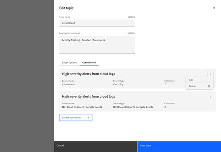
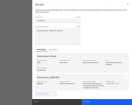
After completing setup, users manage everything through the Edit Topic section the topic is the central entity. From here they can add new filters, update subscriptions, or view the full configuration map. The View Mapping section gives a static visual of the source → topic → destination chain. Phase 2 will make this interactive with drag-and-drop.



Section 04
Source & Destination Management
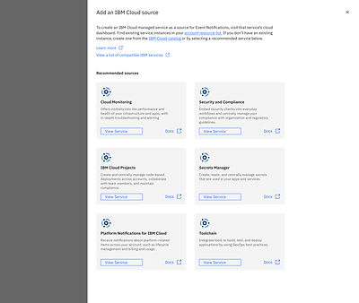
Users can manage individual sources and destinations from the left navigation. From this section, they can create or edit these components, and also view the mapping for a specific source through the View Mapping option.



Section 05
View Mapping feature
After setup, users couldn't visualise how their configuration was connected. View Mapping gives a static visual of the source → topic → destination chain. (Planned iteration: drag-and-drop in Phase 2.)


Section 06
Other section left navigation


What changed and what comes next
Impact
05
Results
Outcomes
Validated in usability testing
92%
Task completion
(up from 78%)
8.3
UMUX satisfaction
(up from 7.2)
4.0/5
User satisfaction
(up from 3.6)
<10m
Setup time target
(vs 45+ min observed)
Projected business outcomes (pending phased rollout)
OSAT lift
Targeting 40 → 68+ to meet industry benchmark, driven by simplified IA and inline validation eliminating the most common failure points.
Support ticket reduction
Targeting 28% decrease by eliminating configuration nightmares that were the #1 driver of support escalations.
Automation reliability
Targeting reduction of the 8% critical automation failure rate through real-time validation that catches misconfigs before deployment.
Adoption increase
Fan-out capability and component reuse expected to increase EN adoption across internal and external enterprise clients.
Reflection
What This Means Beyond the Redesign
What I'm proud of
Holding firm on Subscription
Removing Subscription as a visible UI object was the right call but it required convincing engineering that the API structure didn't need to mirror the UI. That pushback simplified the mental model and was validated in every test session.
What I'd do differently
Involve enterprise users earlier
Our testing was mostly mid-level developers. The fan-out feature managing 50+ notification configs across a platform team was discovered late. It should have been a Day 1 requirement, not a testing insight.
What's next
Phase 2 roadmap
Interactive drag-and-drop View Mapping to visually build routes. AI-suggested filters based on source type. Phased development release aligned with Carbon design system standards.
To experience this feature - https://www.ibm.com/solutions/cloud